Peter Mahnke
on 14 January 2022
Happy Christmas and New Years everyone! I hope you are all ready for a well deserved break.
The Web and design team at Canonical run two-week iterations building and maintaining all of the Canonical websites and product web interfaces. Here are some of the highlights from our final iteration of the year.
Web
The Web team develops and maintains most of Canonical’s sites like ubuntu.com, canonical.com and more.
Updating the ubuntu.com main navigation
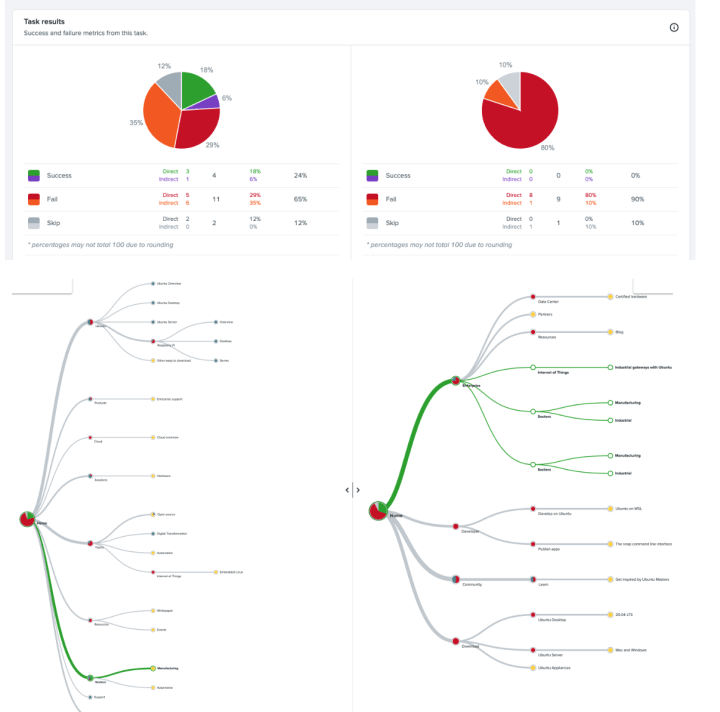
Working with user research we looked at our current navigation on ubuntu.com. We wanted to understand how effective our current menu is, and compared it against a new, potential information architecture. We used a tree jack – a research method that asks users where they would find a piece of information, and presents them with nested drop down menus that represent the current mega menu.
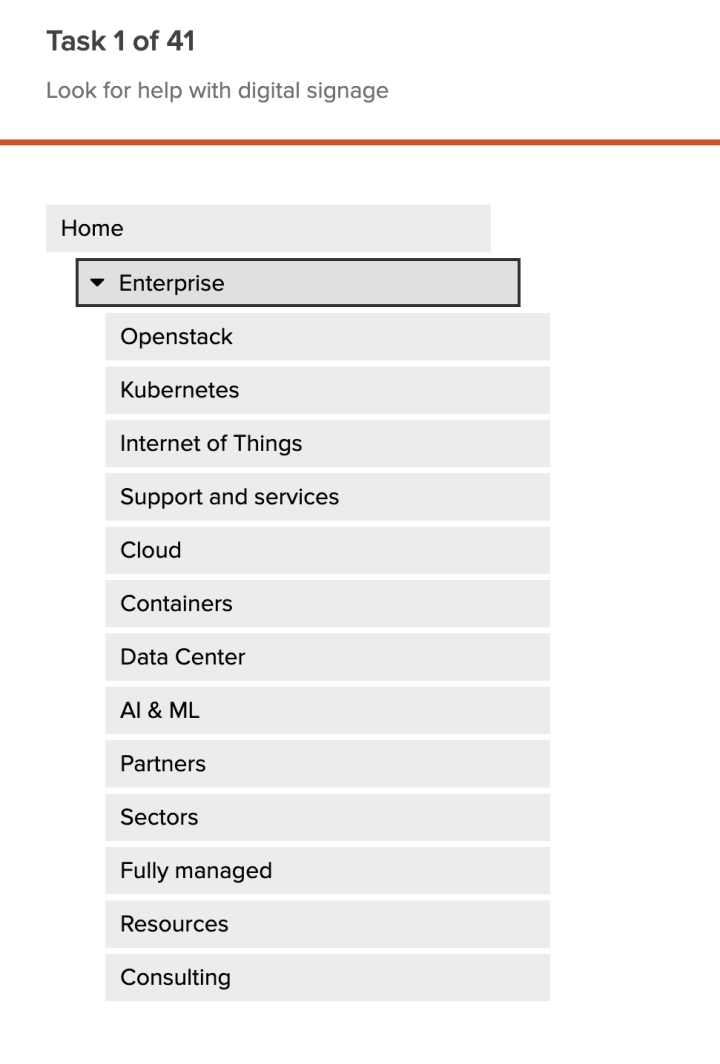
We can then analyse the results to see what route participants take – what do they find easily, and where they go wrong. This gives us some insight into what the participant is expecting to find where.
We also explored how Canonical’s portfolio of products could be presented to visitors to canonical.com. We’ve looked at producing a visual, interactive diagram that shows many of our products and how they can fit together to provide solutions to customers.
We’re also continuing to make improvements to our Ubuntu Certified Hardware pages, adding content to sell the benefits of using certified hardware and why Vendors and OEMs should get their hardware certified.
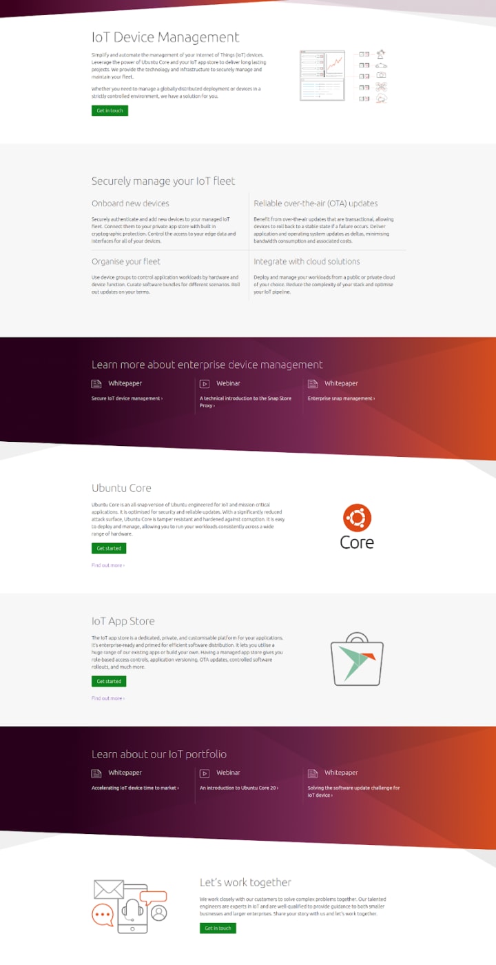
IoT Device Management
We added a new device management page to the Internet of Things section of ubuntu.com, which gives an overview of how Ubuntu Core and the IoT App Store can help manage a fleet of IoT devices in the long term.
Model-driven Operations
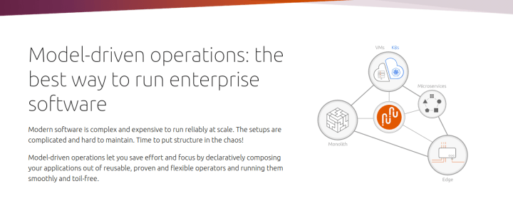
We added a new model-driven operations page to ubuntu.com, which gives an overview of the benefits of model-driven operations, as well as links to further information on Juju and JAAS.
Brand
The Brand team develop our design strategy and create the look and feel for the company across many touch-points, from web, documents, exhibitions, logos and video.
Marketing documents
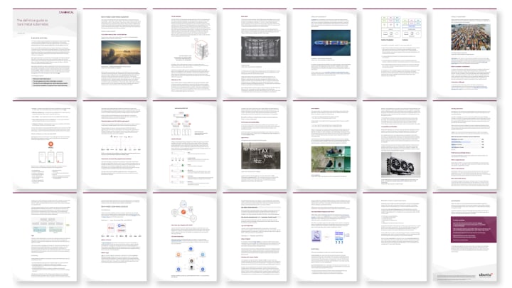
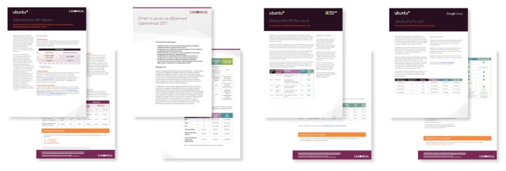
We designed a huge amount of documents in this iteration to be used by the Marketing and Project management teams, from several data sheets to large white papers about the use of Kubernetes on bare metal and the translation of previous documents into Russian.

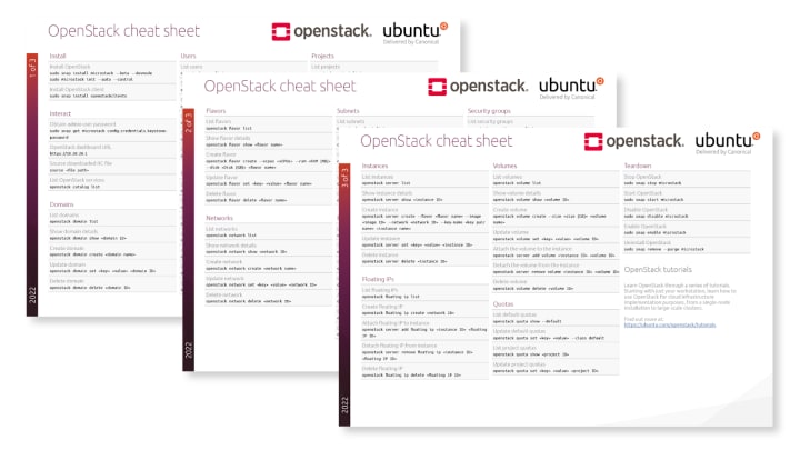
A cheat sheet was designed to help users of OpenStack speed up their workflow and expand their toolset with some useful command line examples.
Ceph is an open source software-defined storage solution designed to address the block, file and object storage needs of modern enterprises. We were tasked with creating a number of diagrams to live on our Ceph pages to help visualise this.

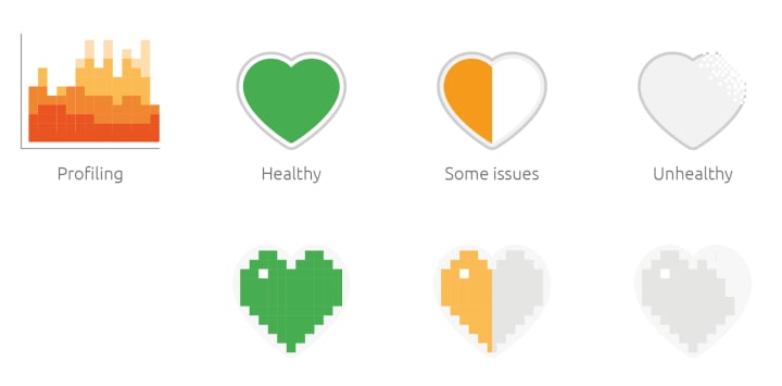
We created a set of icons to be used across our observability pages to represent more types of telemetry, including profiling and health status.
Commercial
The Commercial team maintains and develops all commercial service UIs provided by Canonical. Including the Ubuntu Advantage store.
User research is really important to us on the User Experience team, and we conducted a series of interviews this week about Ubuntu Advantage. The aim was to better understand how our customers engage with Ubuntu Advantage, how they decide to buy and then go onto use the services.
We learned some interesting insights from this research and it will inform our product and design decisions going forward. If you’d like to join and give your feedback, complete this form to join the User Research Programme.
Apps
The Apps team develops the UI for the MAAS project and the JAAS dashboard for the Juju project.
MAAS UI – tag management
Last iteration, the MAAS UX team started to dig into the powerful features of MAAS tags, present in the CLI for years but never exposed in the UI. In this iteration, we have made progress in the first prototype that covers all the user journeys related to tags applied exclusively to machines.
There will be three contact points for the users: the machines list (to assign and unassign tags to several machines), the new Tags tab, and the machine configuration page.
Managing tags from the Machine list
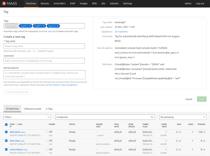
This design replaces the current panel the users see when they click Take action -> Tag
It will allow MAAS users to assign and unassign tags to the selected machines, as well as create new tags with comment and kernel options.
Managing tags from the “Machine configuration” tab
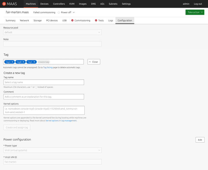
Inside the Configuration tab of every machine, the current tag component will be replaced with the improved version.
Managing tags from the new “Tags” tab
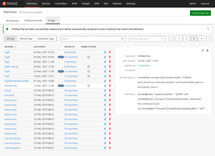
The new tab will centralise the management of machine tags. We are exploring new options to improve the user experience, with smaller tables and a list-detail pattern. From this tab, users will be able to check the tags details, create, update and delete.
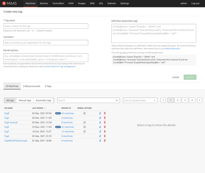
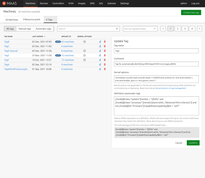
This new prototype will go through a phase of feedback and approvals before the refinement phase and, finally, the visual design phase.
Vanilla
The Vanilla team designs and maintains the design system and Vanilla framework library. They ensure a consistent style throughout web assets.
Preparations for Vanilla 3.0 release
Our efforts during the last iteration of the year were focused on preparations for Vanilla 3.0 release. We implemented the final fixes to the library and published the release candidate version of the package. We also worked on finalising and polishing any updates to the website and documentation.
We reached the finalisation point for Vanilla 3.0, which is ready to be published in the beginning of January.
Inventorisation of components
We also started inventorisation of our components and patterns to have a better overview of the specs and requirements for each of them. This inventory will get populated as we continue with documenting components and patterns as part of the Vanilla UX/UI Working Group.
Marketplace
The Marketplace team works closely with the Store team to develop and maintain the Snap Store site and the upcoming Charmhub site.
Snapcraft
Snapcrafters publisher page
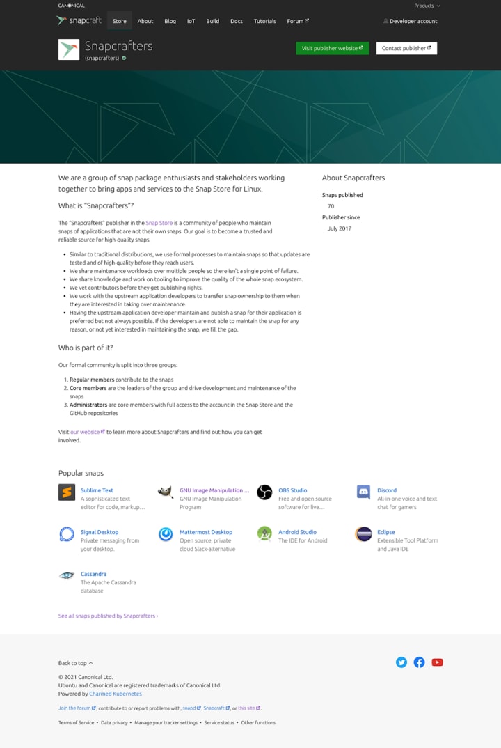
We built a new page for Snapcrafters which showcases all the snaps published by that publisher and provides information about them and how to get in touch.
Snapcraft homepage carousel optimisation
During our a11y workshop recently it came to our attention that the carousel on the homepage which plays automatically can cause problems for people with certain disabilities. To solve this problem we made the carousel static and load a random slide on page load. There is still the option to switch between slides using the controls underneath the panel.
Release UI
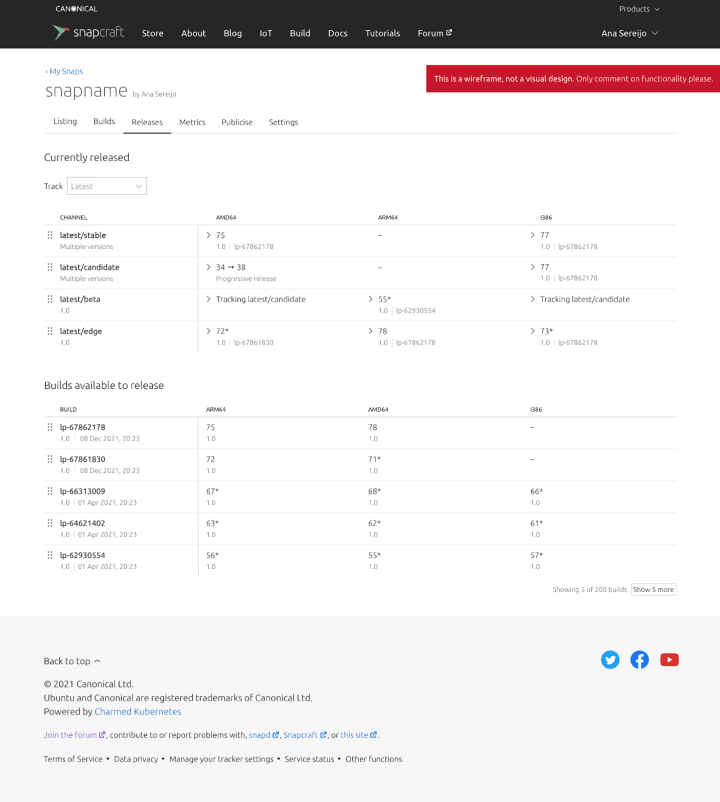
We are working on some further improvements on the release UI and integrating the visualisation of progressive releases.
CharmHub
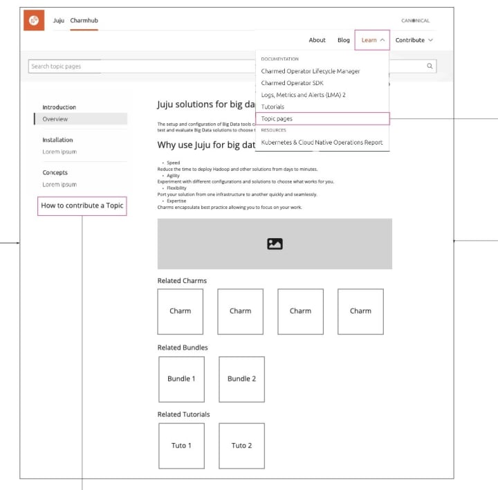
Topic pages
This iteration we investigated how to improve ways of accessing the topic pages, via links in the home page or through the main navigation etc.
The aim is to engage more of the community to make them create the pages though Discourse and how the content should be rendered on the snapcraft website. To help people contribute we created a tutorial on how to create them.
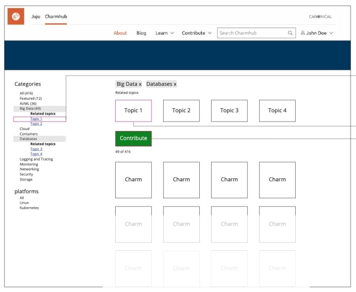
CharmHub Homepage draft with topic links under the categories.
A Topic page draft created in Discourse and published in CharmHub.
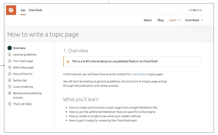
Find the new Tutorial “How to write a topic page” in the “Learn” section.
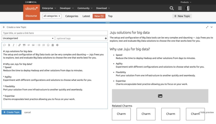
You will be able to create a Topic page from Discourse.
Workplace engineering
The Workplace Engineering tribe works closely with the Human resources department. Canonical is growing, the team helps people who are part of the recruitment process. One of the projects the team works on is a set of dashboards for them to get a sense of the health of the jobs they manage.
We recently harmonised the visual layout of the different dashboards across stages. In every stage the top shows the pending actions for the team member (in the example, review applications) and the bottom part shows the past activity to help Canonical balance the workload between team members who are contributing to recruitment.
We also worked on the navigation. The first level navigation will help employees navigate between the Dashboards and the Docs (which will include documentation related to recruiting). Once in Dashboards, team members can navigate through the different stages of the recruitment process.
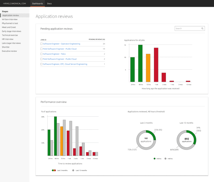
Design example of the Application Review page in the Hiring Dashboards site.
We are hiring!
With ♥ from Canonical web team.


